Graphic design has a never-ending index of sub-segments and shortcuts. Even professional graphic designers have yet to learn them all. Which ones are ‘need to know’ terms, and which ones aren’t necessarily crucial to the design process? We’ve laid out the top 5 terms you should know as a graphic designer. Enjoy!
FPO (For Placement Only)
“For Placement Only” or “For Position Only” is used in both digital design and printing. It serves as a placeholder within a layout to indicate where the final version of an image needs to be placed before the work can go to the market. It can either be stamped onto a stock photo placeholder or represented in a shape with “FPO” where the content needs to be placed. FPO is commonly used in agencies that work in stages and teams. Oftentimes, FPO can prevent the wrong picture, copyrighted images or low-resolution photos from going to print.

Wireframe
Wireframes are like blueprints for your website. It allows a designer to map out the design and flow of an entire website or application. Wireframes serve as an all-in-one solution for taking a concept, to design, to reality. There are a number of different ways to create wireframes. Programs like Adobe XD make it very easy to create a realistic and interactive version of one of your designs. On the other hand, the classic pen and paper combination can always do the trick. When dealing with wireframes, you’ll also hear the terms UX and UI thrown around. UX and UI, or User Experience and User Interface, respectively, are fancy words for how a user interacts with either your website or app. Your designs play a huge role in enhancing a user’s experience and allowing for easy navigation throughout the site or app.
Kerning
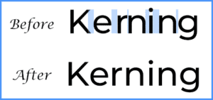
In typography, Kerning is defined as the process of adjusting the spacing between two characters of text to become more visually pleasing to the eye. Kerning is typically used when creating a custom font for a logo. Most fonts do not require kerning as this has already been done in the making of the font. Kerning can make a logo look just right or uneasy to look at so make sure you pay close attention to your spacing when designing a logo.
Lorem Ipsum
Lorem Ipsum is a term in the typography world that means filler text. It is used in a similar fashion as FPO. It lets a designer complete the visual aspect of a piece of work before it gets sent to a copywriter or editor to add in text. Filler text consists of mixed up letters and words of Latin origin orchestrated to look like paragraphs and sentences. For example:
Lorem ipsum dolor sit amet, consectetur adipisicing elit, sed do eiusmod tempor incididunt
Filler text tends to be more visually appealing and believable which is why designers opt for it rather than just typing “sdkfjs sdjfsdk sdkfjie be0fij jksd” to fill the negative space.
RGB & CMYK:
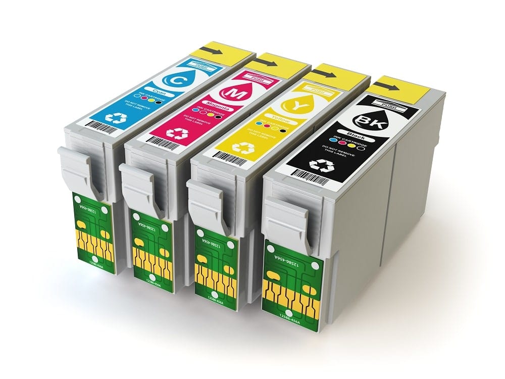
These two terms represent two different color modes. RGB simply stands for Red, Green, and Blue. They are the color mode for the pixels in an electronic display like your computer screen, phone or television. CMYK stands for Cyan, Magenta, Yellow, and Key (Black) which is the color mode used for colored printing. It is important to know the difference between these two color models because when working in platforms like Adobe, your colors will appear different if you’re in the wrong color mode. CMYK should be used exclusively with the intent to print while RGB can be used for items that are staying digital.


